
Why Fast, Responsive Websites Are Essential for Conversion
See how speed, responsive design and clear customer journeys work together to support stronger website conversions.
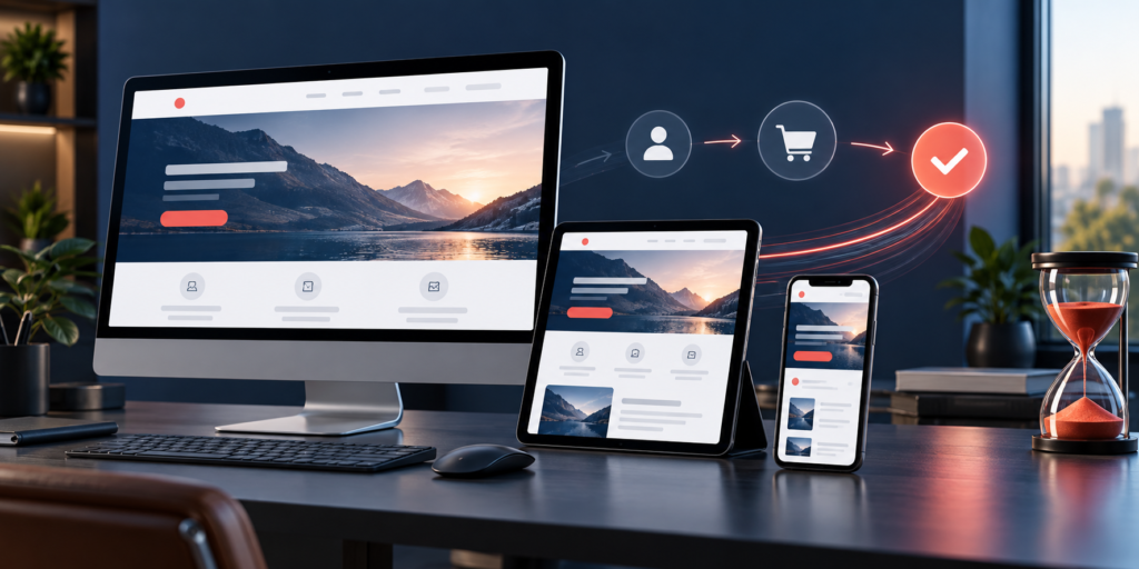
A responsive website must do more than fit the screen
A website can technically adapt to a phone and still create a poor customer journey. Text may be readable while navigation remains difficult, the primary action may sit below unnecessary content or a form may become frustrating to complete. Responsive design should preserve understanding, confidence and task completion across devices—not simply rearrange the same layout.
Speed has a similar role. A fast page cannot rescue an unclear offer, but delay can interrupt a useful experience before a visitor reaches the information they need. Conversion improves when performance, content, interaction and trust work as one system.
Map the customer task before designing the page
Start with the reason a person arrives. A service buyer may need to confirm capabilities, proof and the next consultation step. A product buyer may need availability, specifications, delivery information and a reliable checkout route. Identify that task before selecting sections or visual effects.
For each important page, write down the question it answers, the evidence a visitor needs and the action the business can support. This creates a useful priority order for desktop and smaller screens. It also helps teams remove content that looks polished but does not assist the decision.
Design mobile journeys with real constraints
Mobile visitors may be using one hand, a limited connection or a small screen in a distracting environment. Keep navigation choices understandable, place essential information early and make interactive controls large enough to use comfortably. Avoid requiring hover, and check that sticky elements do not cover headings, form fields or calls to action.
Content order matters when a multi-column desktop layout collapses. The mobile sequence should still tell a coherent story: what the offer is, who it helps, why it is credible and what to do next. Test the actual reading order instead of assuming the visual grid will translate correctly.
Treat performance as a design requirement
Performance work is most effective when it begins during planning. Choose images at appropriate dimensions, use efficient formats, limit unnecessary third-party scripts and avoid loading interactions that are not needed for the page’s purpose. Give media explicit dimensions so the layout remains stable while assets arrive.
Prioritise the content a visitor needs first. Below-the-fold images and optional components can load later, while the main heading, navigation and primary action should become usable promptly. Review performance again after analytics, chat tools, advertising tags and other production scripts are installed; the finished page is what customers experience.
Reduce friction around the conversion action
A clear call to action should describe the next step and lead to an experience that matches it. If the button promises a consultation, explain what information is required and when the visitor can expect a response. If the action begins a purchase, show essential pricing, delivery and policy details before asking for commitment.
Forms deserve particular attention. Request only information the team will use, provide visible labels, explain errors beside the relevant field and preserve entered information when validation fails. Confirm that keyboard users can reach every control and that focus remains visible. A shorter form is not always better; a purposeful form is.
Measure the complete customer journey
Page views and form submissions provide only part of the picture. Review whether visitors reach key information, whether error rates change by device and whether completed enquiries are suitable for the service. Combine available analytics with feedback from sales, support or operations.
When making improvements, change one meaningful part of the journey and record the reason. A faster image, clearer service summary or simplified form may affect several metrics. The goal is to understand whether the experience became more useful, not to chase a single number without context.
Pre-launch website checklist
- Confirm the purpose and primary action of every priority page.
- Test content order, navigation and forms on representative screen sizes.
- Compress and correctly size images and other media.
- Check layout stability while pages load.
- Test keyboard navigation, visible focus and form errors.
- Review production scripts and third-party integrations.
- Validate analytics without exposing unnecessary customer data.
- Ask the responsible business team to test the complete enquiry or purchase route.
VayuTech builds websites around clear customer tasks, maintainable systems and measurable business journeys. Explore our custom website development and WordPress development services, or discuss your website project with our team.